

Oracle AppsLab

Fun With Maps
Maps are one of the oldest and most powerful forms of visualization. Lately I’ve been learning how to make my own maps using open source data and public APIs.
I started by simply plotting locations on a world map. World maps in svg format are readily available on the web. Wikimedia Commons, for example, has free maps in a variety of formats. The simplest is an equirectangular projection.
It’s dirt simple to plot locations on an equirectangular map: longitudes are X and latitudes are Y. All you have to do is scale your svg to the size you want and then multiply your X and Y values by a zoom factor to match.

Comparison of map projections
But most mapping applications (Google, Open Street Maps, etc.) prefer the Mercator projection, or to be more precise, the web mercator or “spherical pseudo-Mercator”. Converting latitudes and longitudes requires a bit of trigonometry, but not much. For my projects I chose a map from amcharts which is free with attribution for non-commercial uses.
If you look inside this svg file you will find a nice surprise: each country is individually tagged. Among other things, this makes it easy to color code each country by region or anything else. Here is a region map I made:

Individual countries colored by region
By adding just a bit of css and javascript, you can also use these tags to make a map interactive, with rollovers and click actions. For a nice tutorial on how to do this, see this article from Smashing Magazine.
I’ve built all my maps using NodeBox. NodeBox lets me import svgs, slice them up, and layer in additional information from data imported from csv or json files. Here, for example, is a map of locations and timezones I made for a work project I did a few years ago:

World map with city bubbles and time zone bars
The blue and red dots represent cities where workers were located. In order to place them, I needed latitudes and longitudes for each one. Since my data file only had city names, I had to look up each city and enter the coordinates by hand. This was before I learned about the marvels of public APIs. (For another example of what you can do with public APIs, see Fun With FaceBook.)
As you might expect, Google has a very polished and complex set of public APIs. Give one of these APIs a city name and it will spit back its latitude and longitude; give it a thousand cities and it will do the same in the blink of an eye. To try this out, I decided to make a new map of Oracle offices around the world using an old spreadsheet I had lying around. This spreadsheet had 146,000 rows of employee data which referenced 403 distinct city names.
The first challenge when using Google APIs is figuring out which API family to enable. There are currently 17 different families, each with different pricing plans. Most APIs are free up to a certain number of requests per day.
For this project I needed the Web Services Geocoding API. In order to use it, I first needed to get an API key, which requires a credit card (even for free requests). I thought my request would be free, but accidentally went over my limit, incurring a charge of $3.75. So proceed with caution.
Once you have an API key, the request itself is straightforward; you can even just type it into a browser if you want:
https://maps.googleapis.com/maps/api/geocode/json?address=LOOKUP_STRINGkey=YOUR_API_KEY
For lookup sting I just fed it a list of city names from my CSV (with spaces replaced by plus signs). Results are returned in JSON format with a hierarchy of values including short name, long name, etc. One of these, location, gives you latitude and longitude. You can query for that using JSONPath notation: e.g. $.results[0].geometry.location
Once you have the latitudes and longitudes, and the formula to convert these into Y and X coordinates, it’s a simple matter to plot city dots on your svg world map. Here is my final result:

World map with 403 city locations
Google’s API is a simple thing, but it makes maps like this much faster and easier to create. It’s a nice example of the ways in which public API data can augment and complement existing enterprise reporting tools, filling gaps in the available data.
Plotting locations on pre-existing maps is just the beginning. In my next installment I will roll up my sleeves and really start to make maps of my own. Stay tuned!Possibly Related Posts:
Heading ‘into the wild’ for guerilla research on emerging tech
The OAUX Emerging Technologies team, or The AppsLab, researches technical innovations coming down the pipeline. Part of our goal is to assess the potential of the technology – is it easy to adopt? Are there use cases that might make work easier for enterprise employees to complete their tasks?

Our research on emerging technologies finds three ways to enhance the user experience: Automate tasks to increase efficiency, advise customers on the best practices based on their business context and objectives, and discover actionable use cases.
Oracle invests in such research because it helps determine the direction of the Oracle Cloud Applications user experience. We are always looking for new ways to improve the delightfulness of our overall user experience on multiple levels. New technologies can be a part of that, by allowing us to be more efficient and just by being fun to use.

Anthony Lai shows customers at an Oracle HQ lab tour how we explore and test capabilities of the MUSE, a brain-sensing headband.
It can be easy to become enamored with the novelty of new technologies and forget who the technology is supposed to help and IF it can help. This is why our team’s mantra is to focus on the user, not the technology, and why we take user feedback on new and emerging technology seriously.
Now – here is the problem.
A majority of our customers do not own the latest wearable or smart home device. It’s difficult to interview end-users about how they might use a technology that they may not completely understand. They may not be familiar with it at all.
As Bill Moggridge, co-founder of design company IDEO and an outspoken advocate for the value of design in everyday life, said, “The only way to experience an experience is to experience it.”
To solve this gap, the AppsLab procures technological innovations as they get released and brings them directly to Oracle customers at conferences for spontaneous feedback. We call this guerilla research. This is where we:
- Approach customers “in the wild.”
- Ask a few questions about the technology.
- Give them a few tasks to perform.
- Observe their interactions.
- Ask about their experiences.

When the Samsung Gear VR was released, the AppsLab took VR to Oracle customers and conference participants in different cities to gather diverse and quick feedback. Not only was the experience immersive, participants loved how they could safely confront their fears of water and heights. That finding opened doors for virtual training in dangerous work situations.
It is a fast and low-cost method to gain sufficient insights for informed decisions. In the past we have performed guerilla research on the Apple Watch, Samsung’s Virtual Reality Headset, our version of the Smart Office, and chatbots. With this tactic, we may talk to up to 40 customers at a time.
What have we learned?Through guerilla research we found that, surprisingly, VR isn’t as nauseating to experience as we originally thought! And, not surprisingly, chatbot humor doesn’t translate well from region to region.
Feedback —good or bad— is a gift. Through our research, we have exposed use cases that will improve accessibility as well as productivity for employees such as warehouse workers and sales. We’ve started conversations around HR and security concerns that Oracle should address if the company moves forward with certain new technologies in mind.
Ultimately, we aim to inspire our customers and partners to think about the future of work and how to introduce new technologies into their organizations. We want them to walk away and think, “Gee, I can’t imagine a future without this!”

A customer’s jaw dropped in awe when he finished navigating a Sphero ball through a maze using his brain waves.
Guerilla research is one of the many research techniques in our usability toolkit. Bringing emerging technologies to our customers and performing direct research with them is more valuable than designing with assumptions about the future. That is an ongoing pillar of Oracle’s cloud UX strategy: We focus on the user, not the technology.
ResourcesThe OAUX Emerging Technologies team also posts on Oracle Applications User Experience blog.
For more information about how we fit into Oracle’s cloud user experience research and design work, explore the Emerging Technologies page.Possibly Related Posts:
- AppsLab Research in 2015
- VR Research at OBUG
- Emerging Technologies and the ‘Glance, Scan, Commit’ Design Philosophy
- Get a Look at the Future Oracle Cloud User Experience at Oracle OpenWorld 2015
- Modern CX 2016
How do we build for the future?
How do we imagine and build a solution for the future that screams,
I want to live in a future where this thing exists and is used by people.
Recently, the Appslab Team attended the Future Summit SF where we learned how we could better design and build experiences for the future. We saw an inside peek from how companies such as IDEO, AirBnB, Netflix, Lyft and Facebook design to solve complicated user needs in the future. Two talks made an impression on me that I want to share with you:
- The Shape of the Future by IDEO – Albert Leung, Momo Miyazaki
- Designing the Future at Facebook 8 – Justin Stalh
IDEO has produced a variety of future concepts. Just by going out into the world, they have transformed government policies that reduces the friction of voting.
Just by looking at human population, housing, limited natural resource and technological trends, they re-imagined a sustainable kitchen of tomorrow.
Before they come to the final concept states above, there are a few thinking exercises that IDEO design researchers and makers go through. One is to brainstorm what the future can look like. There are many possibilities that you have to consider when you think about the future:

The Futures Cone outlines the 4 types of alternative futures to consider.
- Possible – There are those futures that we think ‘might’ happen, based on some future knowledge we do not yet possess, but which we might possess someday (e.g., warp drive).
- Plausible – There are those futures we think ‘could’ happen based on our current understanding of how the world works (physical laws, social processes, etc).
- Probable – There are those futures we think are ‘likely to’ happen, usually based on current trends.
- Preferable – There are those futures we think ‘should’ happen based on our socially constructed values.
From the number of possible futures you come up with, you are essentially breaking down your ideas into a number of probable futures to design and build for. Design for where things are going to be.
To help even begin thinking about possible futures, I’m taken back to my own undergrad HCI studies. My professor would have the class do a similar design exercise with great effects to generate creative solutions to business problems. In addition to focusing on the future, he asked us to consider 3 technological questions when brainstorming:
- Imagine what solutions are possible if no technology existed (e.g., no cell phone).
- Imagine what solutions are possible with only today’s technology.
- Imagine what solutions are possible if there are no technological limits (e.g., instantaneous transportation).
In addition to those 3 questions above, it is important to go out into the world and perform some environmental scanning to see what future signals exist that may shape the world of tomorrow.
IDEO uses the STEEP frame work to help them get a holistic view of what can happen on the future.
- Social
- Technological
- Economical
- Environmental
- Political
Expand your focus across time. I personally like to check out future timelines to keep abreast of research backed predictions of the future. Also, don’t forget to look at experiments of others.
Finally, you should bring our concepts to life by making. Like IDEO, our team found that the best way to test our hypothesis and concepts for the future is to prototype. We have played and experimented with a variety of technologies like AR and BCI headsets. A common comment we get from customers that come through our labs and see our demos is that it looks like we have a lot of fun!
The only way to experience an experience is to experience it.
Yes, our team does have a lot of fun, but it is necessary fun. Making for the future means that you are thinking for the future. To make informed design decisions and iterate on our imagined solutions, it is important to prototype and take that out into the world so that everyone can experience, understand and be inspired by what you have brought to life.
Hmmm…but I’m not creative enough nor smart enoughCreativity is finding connection between 2 unrelated concepts.
Humans by nature are very good at discerning patterns. Justin Stalh said it best that the more things you have in your head, the more chances you have at finding connections between things. Basically:
- Read anything – Read books from different time periods, read about people who are different from you, read about industries you are not familiar with and read about different principles.
- Keep your ears open – In the same vein as above, talk to people with differing views from you and differing cultures. This extends to social media as well. Follow people who are have different interests from you.
All and all, don’t forget delight. Regardless of what you imagine and build, it is real people who will be affected by it.
Possibly Related Posts:
- From Concept to Code
- Heading ‘into the wild’ for guerilla research on emerging tech
- Oracle OpenWorld and JavaOne 2014 Cometh
- McAfee’s Own 9x Problem
- Ultra Subjective Space
Kscope GO and IoT Workshop at Kscope17
![]()
Kscope17 is just around the corner and it is not a secret that we love ODTUG‘s Kscope since it is a conference geared towards Oracle Developers. This year as we have done in previous years, we worked closely with the conference organizers to bring a unique fun experience. We developed an Augmented Reality game called Kscope GO. The concept of Kscope GO should be familiar to all, since last summer the world saw an unprecedented success of the mobile app Pokemon GO. Here at the The AppsLab we have been experimenting with Augmented Reality for many years and we see great potential in a handful of enterprise use cases. But Augmented Reality is not the only technology used in the game, we are using Bluetooth beacons (Bluecats) instead of just relying on GPS signal, also we are using the mobile phone’s accelerometer (for position) and magnetometer (for compass) to deliver a funner experience.
All you have to do is download the app (iOS or Android), self register and start looking for Kscopémons. Each creature has different points and the top three players with the highest points can win some sweet prices!
First place: DJI Phantom Quadcopter Drone with HD Video
Second place: 360fly 360° HD Video Camera
Third place: WowWee MiP Robot

IoT Workshop at Oracle Code in San Francisco
But that is not all! We will be also on site giving the same IoT workshop we have been giving during Oracle Code World tour. Look for us outside of the ballrooms on level 2, next to the OTN Lounge. We will show you how to get started with the Oracle IoT Cloud and you will be able to take home one of our IoT kits (while supplies last.)

IoT Cloud Kit
See ya in San Antonio Texas!Possibly Related Posts:
- Kscope16 Scavenger Hunt
- ODTUG Kscope16
- IoT Workshop and Robots
- Fun, Games and Work: Telepresence Robots
- Oracle Code Behind the Scenes
It’s Been 10 Years
Ten years ago, Paul posted a brief introduction to our team and our mission.
He, Rich and I embarked on this journey in March 2007, soon to be joined by Anthony, and none of expected to be around as a team for more than 18 months max.

Photo by Jeremiah Owyang
But, here we are a decade later, having moved around between a few development teams within Oracle, settling into our home in Oracle Applications User Experience (OAUX) most recently in late 2012.
We’ve thrived here in OAUX, under the guidance and support of our group vice president, Jeremy Ashley, and we’ve grown from a tiny band of developers into a full-blown team, complete with research, design, product management and development.
Our mission remains the same, study emerging technologies, research their potential impact on our users, design intelligent solutions and build (and break) quickly.


Ten years later, and I still have the best job at Oracle, thanks to an ongoing commitment to invest in innovation.
Thanks for reading. Given how much interesting content the rest of the team produces, I might not post again for another ten years.Possibly Related Posts:
- New Content on Our Oracle.com Page
- Profit Magazine Showcases the Innovation Challenge in Mexico
- Lots of OAUX Updates
- Celebrating 5 Years in Oracle’s Mexico Development Center
- Here We Grow Again
Maker Faire 2017
Another Maker Faire has come and gone, the 12th one already. Unlike last year, Oracle had a booth again at the Maker Faire, staffed by my colleagues and myself throughout the weekend, where we showed of some fun demos. Here are some impressions, both from reactions in our booth and from the grounds.
The Booth
Empty Booth

Booth All Set Up
We shared the booth with the Oracle IOT Cloud Applications team who brought their Chocolate Factory and vending machine:

Oracle Chocolate Factory (right) and vending machine (left)
The Oracle Chocolate Factory and vending machine demonstrate an end-to-end modern supply chain including IoT.
The Oracle Chocolate Factory and vending machine demonstrate an end-to-end modern supply chain including IoT. It was designed with a part that fails on a regular interval, every 2-3 minutes so that we can demonstrate predictive maintenance in a manufacturing context. It is also reporting production back to the supply chain. Behind the scenes, it has 3 Raspberry Pi’s and 2 Arduinos with many motors and sensors. 100s of the parts are all 3D printed including gears, tracks, fans and most of the mechanical parts. The Vending Machine is reporting the inventory levels to the Cloud using IoT Cloud Service. It has a Raspberry Pi controlling it with a DC geared motor and optical beam sensor for each hopper.
For more images of the factory vending machine and 3D models you can visit: https://jasperpotts.com/project/steampunk-iot-chocolate-factory/
The Appslab Demo’sWe showcased The IoT Nerf Gun and Target:

Our GVP Jeremy Ashley bravely posing in front of the IoT Target with the IoT Nerf Gun pointed at it.
We discussed the build earlier here, but here is a quick recap:
Using an ESP8266 (ESP-12) chip, we were able to mod a few Nerf Guns so they can connect to the internet. The chip, which is widely available for about $5, is Arduino compatible and has upwards of 10 GPIOs, depending on the model. We hooked up one GPIO to the flywheel motors in the Nerf Gun and another one to a servo that we added ourselves to control the trigger mechanism. The (C++) firmware on the chip orchestrates the launching of the darts by spinning up the flywheel and then pushing darts through the flywheels. The whole mechanism is powered by the on-board batteries in the Nerf Gun, no additional power is needed.
Since the Nerf Guns are addressable on the internet, we were able to add some amazing capabilities to these toys, like voice control and remote management. We even gave a Nerf Gun it’s own Twitter Account (@IoTNerf) so it can tweet what it is thinking.
The Emotibot:

Emotibot
We discussed the build earlier here, but here is a quick recap:
The Emotibot is an emotion sensing robot. Using cognitive image recognition, this robot can tell if you are happy, surprised or even sad. It will try to match your mood by changing colors: Blue if you are sad, yellow if you are happy. The Emotibot uses a Raspberry Pi as its brain. The mouth is controlled by a servo motor, and the nose is an ultrasonic sensor that can detect distance. When you get close enough, the Emotibot will take a picture to analyze your mood.
And Pac-Man on-a-string:

Pac-Man on-a-string Game
We discussed the build earlier here, but here is a quick recap:
It plays similar to the great old Pac-Man game on a primitive PC screen, but with a modern twist. The game events and scores are sent to the Internet while you are playing the game, and that signal is sent to a tablet to show the Scoreboard and Leaderboard.
Raymond Xie mentored 4 middle-schoolers (Addison, Emily, Yiying, Jack) on IoT topics using Arduino and NodeMCU, and this game box was a final project to combine all the concepts and skills they have learned. The Arduino Mega board is the brain which has the entire game logic, and coordinates with the joystick controller, user action, and LED light patterns. The NodeMCU serves as a network link, so game events and live scoring can be published to a MQTT channel, where an Android app subscribes to it. The Android device serves as the game score interface to display live scores from the game box, as well as display the leaderboard from data saved in an Oracle Apex backend.
You use the joystick to control a segment of 5 LED lights, to move up and down along the LED strip. Joystick UP-DOWN to move around, LEFT to collect gem (hint: middle LED light gets you higher score), RIGHT to attach wasp (hint: timing is important).
I also brought my Internet connected Pokeball as a conversation piece:

Jeremy Ashley showing the Pokeball to some booth visitors
The booth was a tremendous success; frequently our demo’s were mobbed by young and old alike, the Nerf Gun especially was a crowd pleaser:

Me trying to hold it together at the Nerf Gun station
I thought Oracle did only databases or something, I didn’t know Oracle did cool stuff like this.
The comments we received were universally positive, a lot were surprised that Oracle and people working there were involved in creating anything none-database related, comments like: I thought Oracle did only databases or something, I didn’t know Oracle did cool stuff like this.
So now you know, we do really cool stuff at Oracle and we show some of it at the Maker Faire, some of it in our Labs.
Trends at the FaireThe trends are mostly evolutionary rather than revolutionary. CNC‘s are still trying to go mainstream and struggling with UX, drones are still racing and battling each other in cages and the 3D printer space is alive and kicking. IoT is creeping into ever more devices, VR and AR are still battling it out and AI is getting ever more creepy. One demo at the Microsoft booth recognized me as a 46-year-old, 6 feet tall, caucasian, smiling, male (all correct!) in the blink of an eye as I was walking by their camera. I just hope it couldn’t read my mind as well…
There was 1 product that I would like to mention though: the ONO – The First Ever Smartphone 3D Printer. If these people can live up to their promises (and that is still a big if, I saw no working product at their booth) this could democratize the 3D printing space. For $99 you get a resin based 3D printer that produces near perfect results. The technology seems to be very similar to the Carbon 3D printer. The big difference is that they use your smart phone as the brains of the printer. Their resin is sensitive to visible light rather than the UV sensitive resin used in the Carbon printers so they can also use the screen of your phone as the projector. As a result, the printer is basically just a receptor for your phone and the resin and is dirt cheap. They had finished prints at the booth (but again, no working printer) and they look amazing.
This voting booth was pretty fun, you voted by walking through the gates, left = Emacs, right = VIM:

Text Editor Voting Booth
Oh, and it turned out that this guys worked across from our booth all weekend, but I only saw him at the end, during cleanup:

The one and only Ben Heckendorn (@benheck)!
Thanks to Laurie Pattison, Erika Webb and Mindi Cummins for organizing and to Raymond Xie, Anthony Lai, Tony Orciuoli, Joe Goldberg, Vinay Dwivedi, Noel Portugal, Lalo Lopez, Antonio Aguilar and Thao Nguyen for providing the demos and helping out at the booth.
Looking forward to our upcoming 2nd Oracle Maker Faire hopefully somewhere in October!
Cheers,
Mark.Possibly Related Posts:
- Summer Projects and a Celebration
- Emotion Recognition at Oracle Maker Faire
- See the IoT Nerf Gun at JavaOne
- Connect All the Things: An IoT Nerf Gun
- ESP8266 – Cheap WiFi for your IoT
Developer Experience: How Do We Improve
In the first part of this series I introduced the concept of Developer Experience and why I think it is important that we start investing more into improving the Developer Experience. In this part I will lay down some foundations on how this could be done.
The pillars of DX
Not all developers are alike. You can see this within a company like Oracle: developers in the DataBase group are different from developers in the Middleware group, who in turn are different from developers in Application Development. They have different skills, write in different programming languages and use different tools. Even within groups there are differences. e.g. between CRM and HCM, and even between product teams in the same group (e.g. Human Resource and Payroll). Developers use different lingo to verbalize their domain, build their own tools, etc.
It is imperative that you get to know how a developer goes about their day, not only what tools they use but also how they use them.
Simplify All the ThingsWhen a device as simple as a door has to come with an instruction manual – even a one-word manual – then it is a failure, poorly designed.
– Donald Norman, The Design of Everyday Things
The tools and APIs we create for developers need to be designed to be intuitive to use:
- Use affordances to guide the developer: clearly name the API, the parameters it needs and what it returns. If errors are raised, make them understandable and actionable, explain how the developer can fix or avoid the error.
- Try to “design away” common problems rather than documenting workarounds. The more work you put into the design of the API and tools, the less support you need afterwards.
It’s worth pointing out again that designing for simplicity is not easy, “simple” != “easy”; it is very simple to stop smoking, but it surely is not easy.
Simplicity does not negate the need for supporting documentation, forums, examples, etc. These tools need to cater to beginners and experts alike. Novices need to be able to get started quickly but experiences users need deeper knowledge as their requirements get more sophisticated. This can be done by establishing conventions that can be overridden with configuration options (convention over configuration), essentially you default as much as possible for the new user. Experienced users can then override these defaults.
Simplicity is hard work. But, there’s a huge payoff. The person who has a genuinely simpler system is going to be able to affect the greatest change with the least work. He’s going to kick your ass. He’s gonna spend more time simplifying things up front and in the long haul he’s gonna wipe the plate with you because he’ll have that ability to change things when you’re struggling to push elephants around.
– Rich Hickey, Creator of the Clojure programming language
These concepts are pretty much identical to UX pillars, remember, UX ~= DX!
Practical DX

Find out who will be using your Tools and APIs (for the rest of this article, APIs are considered “tools”) and create personae to represent those users. Then build your Tools for those personae, not some imaginary “average” developer. Also understand your users’ users, i.e. who are these developers building applications for. E.g. if you APIs are being used in off-line applications, you might not have to focus so much on performance, maybe the end users are more interested in precision instead (think financial applications). Having an understand of all these factors will improve you API design.
It is equally important to understand what devices they are writing applications for. APIs for Mobile Applications might be simpler than those for Desktop applications, wearables could be even simpler.
Practice Developer Relationship Management (DRM)Have a team of Developers (not marketing people) work with the external developer community. Have them evangelize the Tools to developers, provide support where needed and feed input from this community back to development to improve the Tools. Target prized partners individually and the broader community through speaking engagements, sponsorships, hackathons, social channels, etc.
Form partnerships with developers that build cool applications with your Tools. Let them showcase their work in an on-line gallery (“Apps build with CRM APIs!”), provide loaner devices if needed, hand out free development accounts, etc.
Drink Your Own ChampagneThe only way to ensure that your Tools are meeting DX standards is by using them yourself in development. You have to put yourself in the shoes of your potential users in order to see where things can be improved. This is a way of battle testing your Tools before you release them to the public.
Create a Layered ArchitectureCater to the novices with high level Tools that default what they do not need to know and let experienced developers modify and configure those Tools as they see fit. We have to ensure that any developer can build an application with our Tools. When you take an iPad out of its box, you don’t have to assemble it first and then read the QuickStart Guide while you charge the battery, you take it out and switch it on. Our Tools should work the same.
MeasureWe have to measure Tools usage, not (just) for billing purpose, but to gauge their usability. This will allow us to scientifically deprecate and cull certain Tools and improve other ones. Without measuring you cannot know if your API Strategy is even working or improving over time. This should be build into the platform from the get-go.
Flatten the Learning CurveCreate Idiomatic APIs by follow the conventions of the languages and frameworks your API is designed in. If you have a Web Service, this means following the conventions of HTTP and REST. If you have libraries in various languages, avoid the temptation to auto-generate them all from a common base. Instead, have their interfaces designed and battle-tested by people familiar with the language. Make sure they fit culturally.
Build plug-ins for popular development tools that developers are using, e.g. Yeoman, Grunt, Gulp, Bower, Sublime Text … Don’t force them to use your tools.
Provide a Support Ecosystem, this should include On-line Documentation, Recipes, How-to’s and tutorials. We also need to provide an On-line Playground that will allow potential developers to start using our Tools without even downloading anything.
Also, make your APIs Backwards compatible. If you cannot, version your APIs and encourage upgrading while you keep supporting the older versions.
Finally, make error messages understandable, useful and actionable. Nothing is more infuriating for a developer than displaying a useless error message.Possibly Related Posts:
- Developer Experience: What and Why
- Can We Stop Building Tools to Convert Users to Developers?
- Oracle OpenWorld and JavaOne 2014 Cometh
- Simple: It’s not about the UI
- Development on Windows 8.1 Phone and Tablet
Developer Experience: What and Why
For the past 2 years I have been trying to raise awareness of the concept of Developer Experience (DX) both inside and outside Oracle. Over the next few days I will release a couple of blog posts delving deeper into this subject. This first post will concentrate on what DX is and why I feel it is important that we invest in it.
What is Developer ExperienceThe concept of Developer Experience has existed for many years. As a developer, I have come into contact with Developer Experience well before I realized what it was. I felt it the first time I used Bootstrap to style a Web page, or when I used jQuery for the first time to submit an AJAX request, or when I implemented the Braintree APIs to add Online Payments to a Web Application. These were all tasks that I dreaded implementing for various reasons: CSS is tricky to get right cross-browser, as are AJAX requests, and building an online payment platform, well, that’s just downright impossible. Yet these tools somehow made it … simple. What sorcery is this?
Interestingly, it is my current stint at the UX team that finally made me realize what’s really going on here: turns out that the people behind these tools worked really, really hard to make them simple to use; they were engineered that way … on purpose! This is of course exactly what the UX team is doing with our GUIs and the whole experience surrounding the work flows and processes, trying to make them as simple as possible to use for our users (which is really, really hard to do by the way).
Developer Experience is the activity of studying, improving and optimizing how developers get their work done. It observes how developers work, e.g. which tools they use and how they use them, and then tries to improve those tools (or create new ones) and optimize the development process as a whole.
Developer Experience is the activity of studying, improving and optimizing how developers get their work done.
From this definition you can derive that there is a large overlap between User Experience and Developer Experience, in fact, DX can be seen as a sibling of UX where the user happens to be a developer. As a result, many of the techniques used to study and improve UX can be applied to DX.

DX encompasses all aspects of the developer’s interaction with development tools and services. “Tools” are what developers use to design, code, build, test, integrate, release and manage their code and applications. “Services” are what developers use to access data and functionality of an application; these days this usually means REST APIs (and we will use them interchangeably going forward) but this really covers anything that a developer would use to interact with your application. Developers interact with your application using APIs; APIs are to developers what the GUIs are to “regular” users.
APIs are to developers what the GUIs are to “regular” users.
Why Developer ExperienceThere has of course always been a need for improving the experience for developers but I see 2 major trends in the software industry right now that are driving the need to invest more in DX:
- the rise of the Cloud
- the fall of the importance of the UI
This of course refers to the move of everything to the internet (“the cloud”). This trend means that companies are relinquishing ever more control of their IT infrastructure (IaaS), Development Platform (PaaS) and software (SaaS) to a third-party and just pay for usage. The more they move up the stack (IaaS -> PaaS -> SaaS), the less control they have. And this creates some real challenges for our customers, e.g.:
- If I cannot access the server-farm, how do I add a server?
- If I cannot ssh into my machine, how do I install <name-your-tool>?
- If I do not have access to the DB, how do I make changes to it?
- If I cannot access the code, how do I customize the application?
The solution to this is to create APIs that provide this functionality to your cloud customers and so the move of applications to the cloud led to an explosion of easily accessible APIs. This in turn lead to the rise of aggregators and “pure API” companies like Twilio and Braintree that almost exclusively offer APIs and leave the development of GUIs over to their consumers. They make money by offering metered access to their APIs, just like a utility service. Pretty much anything you can think of these days is available as an API, including every example mentioned above (yes, you can add a server to your cluster with a simple API call), other examples include emailing, payments and more recently a whole swat of AI related features like Speech Processing, Image Processing and even Deep Learning.
Developers nowadays expect that a traditional application comes with APIs that offer the exact same functionality as is accessible through the UI. And just like users of our GUIs, developers want these APIs to be simple and easy-to-use.
Developers nowadays expect that a traditional application comes with APIs that offer the exact same functionality as is accessible through the UI.
The same trend has also made it much easier to roll out applications to a massive audience, basically everybody who has an internet connection, about 3.2 billion people, and do it much more frequently. If you are releasing new versions of your software several times a day to all your users, you better make sure that you use tools that support this type of rapid development and deployment. Tools that prevent developers from making (or at least repeating) mistakes like automated tests, Continues Integration and Deployment tools, etc. Again, the role of DX is to assist in this area of development.
Fall of the importance of the UIThe relentless drive for ever simpler GUIs has now culminated into the “text-app”; Instant Message like applications like WeChat and Messenger that try to offer the same functionality as traditional applications but with almost none of the UI. Instead they use a “conversational UI” in which you use natural language to ask something and the software (usually referred to as a “bot”) will then try to perform that task for you. These bots rely heavily on APIs to do the things you ask them to do.
Furthermore, more and more devices appear on the market that are “UI-less”, i.e. they have no UI at all! Probably the best known example of this is the Amazon Echo. And this trend will only accelerate as the Internet of Things takes off; most of those “things” do not have a UI either (light bulbs, door locks, toasters, etc.). And just like bots, these rely heavily on APIs.

Maybe somewhat counterintuitive, this trend makes UX even more important as the way users are interacting with applications is completely changing; affordances that they were familiar with are gone when there is no UI and so new ones have to be developed by UX teams.
More importantly though, it makes DX more important as, increasingly, the “users” of such devices are actually developers. When the Amazon Echo was first released it couldn’t do anything other than play a few songs and tell some (pretty bad) jokes; it was basically a glorified Bluetooth speaker. However, because Amazon provided APIs that allowed developers to interact with the Amazon Echo and development tools to easily implement new so-called “skills”, you can now ask Alexa for an Uber, order pizza, even start your car for you. Crucially, Amazon didn’t have to build any of these applications; they were built by an enthusiastic following of developers. Sales of the Amazon Echo skyrocketed, completely correlated to this rise in skills. So basically, Amazon enlisted the help of thousands and thousands of developers, for free, to improve the sale of their products.
And that is why DX is important.
In the next installment I will delve deeper into what we can do to improve Developer Experience.Possibly Related Posts:
- Developer Experience: How Do We Improve
- Lots of OAUX Updates
- Mash up Oracle Cloud Application Web Services with Web APIs and HTML5 APIs
- Noel’s Amazon Echo Hack
- Barnes & Noble Opens Development for NOOK
Who Likes Me?
In my previous entry, Fun with Facebook, I described how to pull data from Facebook’s Graph API Explorer, organize it using NodeBox, and turn it into representations of friends, posts, and the “likes” that connect them. Here is the final result:

The final “Who Likes Me?” poster
The above image is a snapshot of a high-resolution poster with many fine details. One of my goals for this project was to create a “forest and tree” visualization that pushed the envelope on information density. I wanted to see meaningful patterns from ten feet away while still allowing discoveries in every square inch, so there’s a lot to see.
A four-color topic scheme is used throughout. In the bottom grid each post is represented by a bubble, sized by how many likes it got and colored green for personal, blue for general interest, red for political, and orange for work-related. Post date is on the x axis, post time on the y.

Each post appears as a colored bubble in a date v. time grid
Each of the 6,381 lines rising upward represents an individual like, colored the same as the post being liked. All likes from posts in a given month start at the same fine point and lead to the friend who did the liking. Near the right edge you can see what I call the Trump effect: a higher than usual proportion of reddish political posts and likes in the months around the 2016 election.

Like lines connect the posts in each month to the friends who liked them
My friends are arranged sequentially from left to right in the order we became friends; their vertical position is based on the date we became friends. I made 33 friends in 2008, 44 in 2009, etc. The more horizontal slope on the left occurs because I was adding friends at a pretty good clip for the first few years. After 2010 the rate slowed resulting in a steeper slope. There is a cliff between the middle of 2014 and the end of 2015 when I only added two friends; I resumed a more steady pace after that.

Each friend “jellyfish” shows likes and topic preferences
Each friend is represented by what I call a jellyfish. The tendrils fanning out below each jellyfish are the colored like lines in chronological order. A full spread indicates a consistent pace of liking over the years; a wishbone pattern indicates a few initial likes, a gap of non-interest, and then a resumption in recent months. If topic preferences change over time this is also revealed in the spread.
The concentric circles in the body of each jellyfish show the proportion of topic preferences, with the most liked kind of post at the center and the least favorite topic at the outside. The rings are sized based on radius, not area, to make outliers more visible. Melody is my champion liker with 304 likes in all. I find these jellyfish fish very revealing; you can see at a glance who is political, how varied their interests are, etc. Each one is unique.

The friend map shows where each friend is located on the friend slope
Since I don’t remember when I connected with each friend it can be difficult finding him or her in the conga line of jellyfish. To make lookups easier I added a reference map on the poster’s right edge. Friends are listed in alphabetical order. Next to each one is a repeat of the distinctive shape of my friend-slope with the position of that friend marked as a blue dot.

The post index shows each numbered post in a giant bar chart
On the left edge of the poster I have placed an index to all 904 posts. Each colored bar holds the post number, date, and initial text of the post’s title or caption. The number of likes follows each bar; a preceding triangle marks the posts no one liked. From a distance this index forms a giant bar chart which shows fluctuations in topic and title size. A long run of green bars, for example, correlates with family vacations.

Stacked bar charts show total posts and likes by month and hour
Stacked bar charts along the right and bottom edges of the post grid show how posts and likes vary from hour to hour and from month to month. The bars come in pairs; wide bars show the total number of posts (broken down by topic), narrow bars show total likes. The two bars are scaled so that whenever a likes bar exceeds a posts bar there are an above average number of likes. The hourly bars reveal my predilection for posting at night and into the wee hours of the morning. A peak in April 2011 of posts (but not likes) marks a road trip with many photo posts apparently of interest only to myself.

The friendliness bubble chart shows friendship duration vs. average liking rate
In the upper left corner I have placed a bubble chart which shows all my friends arranged by duration of friendship on the x axis and “friendliness” (mean likes per year) on the y axis. Newly added friends on the right typically start with an initial infatuation which settles as they get to know me better. One relatively recent Facebook connection, Joyce S., currently likes me four times as often as my wife.

Topic chart shows topic distributions for posts (pie) and likes (donuts)
In the upper right corner a delectable pie chart surrounded by three tasty donuts shows overall topic distributions. The pie shows that just over half of my posts are personal. The three donuts show that friends, strangers, and opt-outs all prefer personal posts over any other flavor; surprisingly, strangers (some of whom I know but have not connected with) like the personal posts even more than my friends.
The opt-outs are friends and strangers who have gone to the trouble of telling Facebook not to share their data with anyone (including me). Although I can’t tell who they are and which posts they liked, the total like counts for each post allow me to deduce their overall preferences as a group. Another lesson of social media: even when you opt out you leave traces behind.
LESSONS LEARNED
Although this ponarv may seem a curious use of my time, the techniques demonstrated here could be applied directly to many different enterprises use cases. Posts could be replaced by any kind of business object (invoices, sales opportunities, customer contacts, etc.) and the friends could be any person or resource associated with those objects.
Learning how to work with and visualize public APIs is certainly relevant for businesses today. Even if they are not already participating in the API economy themselves, our customers will increasingly need to access semi-structured public data from social media and other sources to enhance their own internal reporting. I hope to show examples of this in future blogs.
This project was also part of my research into large-form high-resolution information displays for possible use in video walls, control centers, etc. By pushing the envelope I exposed current limitations both technical and ergonomic.
In fact, I pushed a little too far. The file contains over 20,000 vectors with nearly four million points spanning more than two orders of magnitude in font size. It looks great on my laptop and iPad, but panning and zooming is painfully slow. Browsers struggle with it. I finally concluded that the most effective, high-tech way of displaying it was to print it out on paper.
But this also proved problematic. I settled on a forest and tree size of 52 by 39 inches, the largest available wall space in my cluttered house. The first print shop I approached spent two days trying to print this monster – and finally gave up. At 2400 dpi the file would have taken a minimum of 8 hours to rasterize, and the 11-meg PDF would have ballooned into a TIFF of over 30 gigs (if TIFFs could be larger than 4 gigs – which it turns out they can’t).
A second print shop was finally able to print it, but only by reducing the resolution to 600 dpi. This muddied fine details and left the post index unreadable even with a magnifying glass. I could have rectified this by printing it as a wall-sized mural, but then you would need not just a magnifying glass but a stepladder as well.
Speed, memory and cost will continue to improve and expand what’s possible for high density displays, but even when that day comes visualizations will still need to satisfy human limitations. The differential between tree and forest must always fit comfortably between the need for magnifying glasses and stepladders. Interactive displays can show more, but only if they can zoom and filter instantaneously.

The giant Who Likes Me? poster now dominates my kitchen
I did learn a lot about who likes me, my posting habits, and how unique each friend is. The poster elicited a startled “Yikes!” from my long-suffering wife the first time she walked into our kitchen. Now all I need is more wall space.Possibly Related Posts:
- Fun With Facebook
- Choropleths
- Great Design vs. Usability
- Our Real Time Ambient Display at OpenWorld
- Faceforce = Creepiness + Spam
Fun With Facebook
I am often surprised by which of my Facebook posts are the most liked and by who likes what. I wondered: are there any interesting patterns there? Could I visualize them?
My next question (as always) was: could I get the data? Thanks to the rise of the API economy I could. Companies have discovered it’s profitable to make their private data public. IT departments are splitting into private and public-facing sides. Public APIs with user-friendly consoles make it ever easier to slurp up data from almost anywhere – and small amounts of slurping are often free.

Facebook’s Graph API Explorer console
This is great news for quantitative self projects like this one. Facebook’s public API console is called Graph API Explorer. You hit a button to get a temporary authentication token then construct queries by pointing and clicking. Here is the query that I used to retrieve my posts and the people who liked each one:
me?fields=id,name,posts.limit(250){type,message,name,created_time,reactions.limit(200).summary(true){name}}
The result comes back as a JSON file. JSON (JavaScript Object Notation) is the lingua franca of the public data world. The data it conveys is often called “unstructured”, but it would be more accurate to say “flexibly structured”. JSON data can have quite elaborate hierarchical structures but with attributes that are sometimes there and sometimes not.
There are a few caveats, as I discovered. You have to pull down the data in reasonably-sized chunks and then paste those chunks together. The data is curated but not pristine; there were a few duplicate IDs and missing quotation marks that had to be cleaned up. JSON is fragile: if even one comma is out of place in a 2-meg text file havoc ensues. And some data is missing by design. Facebook no longer allows you to query friend lists (even your own) so I had to scrape that list the old-fashioned way. Several of my friends’ likes were missing because they had opted out of all data collection.

NodeBox network converts a JSON query into a set of structured CSV files
The main challenge in visualizing data like this is converting flexible JSON structures to more predictable lists and tables. To do this I developed a NodeBox network that starts with a JSON query at the top, adds in some additional information from other sources, sorts and filters and merges it, then spits out a half-dozen clean CSV files of structured data ready to plot. I had to write a custom CSV output node in Python but other than that no coding was required and the network can be reused for future queries.
I now had a fair amount of data to work with: 904 posts written over 9 years with 7500 likes from 144 friends and 311 strangers. How could I turn this into something visual?

My initial vision had to give way to reality
My initial vague idea was to represent friends as balloons – the more each liked me the bigger the balloon – with strings that would somehow connect to the posts they liked, colored by topic and arranged on a timeline like beads. But initial conceptions must give way to reality; with visualization the design has to follow the data.

Showing posts in a grid is more manageable and revealing
The first inconvenient truth was that a timeline of 904 posts over nine years, with some posts months apart and others minutes apart, was just too long to draw as a single line. So I made it two-dimensional: a grid with months on the x axis and hours on the y. This had the additional advantage of showing what time of day my posts appeared.

My friends evolved from a forest to a line of jellyfish
When I first tried plotting my friend balloons, the multiple strings for friends with many likes looked more like tree trunks, so my balloons became a forest. But it was much more revealing to plot the friends by when we first connected, and to let the stings diverge right away. The final result was something more like jellyfish.

It’s hard to draw thousands of overlapping lines without making a mess
Linking my jellyfish friends to my post grid was the next challenge. These links form what’s called a Sankey diagram. Sankey diagrams rarely have more than a few dozen overlapping links of varying thickness; it’s hard to draw thousands of links without creating a big black mess. After much study I found I could make beautiful and revealing links by keeping them thin, partially translucent, and by aggregating the grid connections for each month down to a fine point.
The final step was to assign colors based on the topic of each post: green for personal posts, blue for general interest, red for political, and orange for work-related. This was the only data I could not automate; I had to assign topics to each of the 904 posts by hand. Once the post bubbles were colored, the lines leading to each post could also be colored, and the jellyfish could be colored as well based on their proportion of topic preferences.
To see the end result and what I learned from it stay tuned for part 2: Who Likes Me?Possibly Related Posts:
- Who Likes Me?
- Fun With Maps
- Choropleths
- Our Collective 500 Terabyte-a-Day Facebook Addiction
- Too Many of Me, Part 2
Find Us at Oracle Code
Oracle Code (@oracledevs) begins tomorrow in San Francisco, and we’ll be there.

What is Oracle Code? Check out the video, which includes our Gadget Lab at HQ, robot arm demo, VR egg chair and Tony O giving a tour.
Specifically, Raymond (@yuhuaxie) and Mark (@mvilrokx) will be hosting IoT Workshops like they did during JavaOne and OpenWorld 2016. Also, Raymond’s Pac-Man on a String will be one of the exhibits. Next week in Austin, Noel (@noelportugal) and Mark will host the IoT Workshops.
Oracle Code events will nearly happen every week, all over the World, and we’re not covering them all. But don’t fret, the IoT Workshops and Pac-Man on a String will be at each event.
Interested? Register for your local Oracle Code event.Possibly Related Posts:
- Mid-June Roundup
- Oracle Code – Recap
- Oracle Code Behind the Scenes
- Oracle Social Network Technical Tour
- Magical Links for a Tuesday in December
Art of Making
Art of Making
I caught up the making virus from our engineers, and, jointly with a fellow parent, volunteered to teach an “Art of Making” seminar at my daughter’s school (my friend’s son came up with the title). Our hope was to bring STEM, art, and design thinking together. (I am supposed to represent art and design thinking, but secretly dream of learning some STEM along the way).
There are about thirty different seminars that students can choose from based on the seminar’s description. Ours was “Don’t take the world the way someone made it for you, make it what you want it to be. Be a maker! The world is full of opportunities for improvement, and everything is a tool. Hi-tech and low-tech. Paper and foil, 3D printers and code. Why, using tools is what made us human. Release your inner humanity by embracing your tool-using nature! In this seminar you’ll play with bunch of hi and low tech staff to make pretty flashy things from fashion to toys, and learn along the way.”
The seminar filled in to a maximum on a first day of signup. 100% boys.
I contracted my daughter to run an emergency promotional program for our “Art of Making” with the goal of bumping up girls’ enrollment. I felt that my daughter knows the best what’s appealing to that audience. And I was right! Her choice of message, channels, and timing was impeccable, and in four days the girls’ enrollment risen up to 50%!

That’s the teen power!
To be continued…Possibly Related Posts:
- Oracle’s Fashion Technology Makers: Soldering, Sewing, and Storytelling
- Teaching to See
- Can We Stop Building Tools to Convert Users to Developers?
- Amy Jo Kim on Applying Game Mechanics to Software
- More About Me at QS15
RIP Oracle Connect
Blogging and long-form content seem so tedious to me nowadays, but if you’ve read here for a while, you’ll recall that I used to post several times a week.
One of the reasons I’ve kept this blog running in the era of ever-shorter content is that it keeps a historical record of this team’s work and our thoughts. As an emerging technologies team, we know that not all our thinking will make it to daylight, so we use this outlet as a way to leave breadcrumbs for ourselves and others.
One such project, Oracle Connect, died a quiet death a few weeks ago.

Connect and OraTweet had been hosted on a machine we were given in 2008, and IT had been trying to decommission that old relic for years. They finally did a few weeks ago, and while Noel (@noeportugal) is salvaging OraTweet, we have no plans to resurrect Connect.
We’ve been urging people using Connect to move to Oracle Social Network for many years, but even so, it still had a handful of users, most of whom reached it via old links on the corporate intranet that haven’t been updated.
Social networks seem pedestrian now, but in 2007, when Connect was born, they were still relatively new, especially inside corporate firewalls. As far as we could tell, Connect was one of the first handful of such corporate networks, and at its peak, it served a couple hundred thousand pageviews a month. Not bad for a little web app managed by a team of four.
Over the years, Oracle Connect has been profiled in a couple books on enterprise social adoption over the years, Niall Cook’s (@niallcook) Enterprise 2.0: How Social Software Will Change the Future of Work and Social Media at Work: How Networking Tools Propel Organizational Performance by Arthur L. Jue, Jackie Alcalde Marr and Mary Ellen Kassotakis.
Back in 2012, I chronicled the History of Connect, if you’re interested in its genesis and trajectory.
So, RIP Oracle Connect, gone but not forgotten.Possibly Related Posts:
- On the Oracle Social Network
- Welcoming the Social Enterprise
- The History of Oracle Connect
- Connect API Goodness
- Random Connect Observations
Some Video of Our Exploits
Lots going on here at the ‘Lab as always, and now, I have video to prove it.
First, a large of our daily routines now involve showing off our demos to visitor to the User Experience Cloud Labs at Oracle HQ. Our demos live in a space we affectionately call the Gadget Lab, and during last year’s OpenWorld, Gozel (@gozelaamoth) had a film crew take some video.
Now you can get a sense of what a tour of our Cloud Labs is like.
Here’s a still shot if you prefer.
If you follow us, you’ll recognize some familiar faces in there. Like what you see? Plan to be at HQ sometime? Why not sign up for a tour of the Cloud Labs?
Another recent video and newsworthy bit is that Mark (@mvirlokx) was in the January edition of Oracle Magazine talking about his Oracle Maker Faire projects.
Wow, the last time I wrote here was July. Luckily, the team has done an excellent job carrying the weight in my absence. See you in another six months or so.Possibly Related Posts:
- Come Visit the OAUX Gadget Lab
- Planning for OpenWorld? Here’s Some Help.
- Busy Times Are Afoot
- OAUX Emerging Technologies in Profit Magazine
- Visit Our Gadget Lab Virtually over the Web
An Oracle Partner Cloud Integration Hackathon in Sydney
At the end of November, Laurie’s (@lsptahoe) Apps UX Innovation Events team organized another fabulous hackathon, this time in collaboration with the Oracle Sydney Office. The goal of the hackathon was to integrate several Oracle Cloud Services and hack together an application built on top of those Cloud Services, using a toy or other device. The AppsLab was prominently represented by Jake, Noel, Raymond and myself as we were invited mentors for the various teams that signed up. This is my report of the proceedings.

We arrived in Sydney on Sunday morning to give ourselves a fighting chance to get over our jet lag before the actual start of the hackathon on Wednesday, but the preparations for us mentors started a few weeks before we set foot on Aussie soil. You see, there were 14 Cloud Services that were made available for the participants, and as mentors, we were obviously supposed to be fluent in all of them. Unfortunately, I myself was only familiar with a handful of these Cloud offerings so I had to learn as much as I could about all the other ones before we headed out. We were given access to all of the services on offer in October and I spend the next 4-6 weeks getting familiar with DCS, ICS, MCS, ACCS, IoT CS and more. Within a few days I was able to port one of our existing services (a universal web scraper Web Service that we use in various other projects, e.g. in the Scavenger Hunt registration application) to ACCS using Dev CS as my Continuous Integration/Deployment platform.
Also as part of the preparation we were assigned to the partner teams, mine was Accenture, and we had a few meetings to review and refine our hackathon elevator pitch. The idea that emerged from our team was a sort of “Kudos” application that would allow anybody to give a present to anyone in their company as a thank you.
On Tuesday we went into the Sydney office to meet our fellow, local mentors, mostly from the ANZ Sales Consulting org. Oh, and they also brought their toys, the famous Anki car demo!

Anki Car demo
That’s an Oracle Cloud driven Anki car race track of 84 pieces (it actually broke the Anki iOS app which seems to only be able to handle a 64-piece track)! What you can’t see in this picture is that they were filming this with their DJI Phantom drone, right there in the office. It was made available to the participants (using the Oracle Cloud API Management Service) to integrate in their solutions, which some actually did, but it was just plain awesome to look at (and play with). They actually took this behemoth on a tour, you can find more information here
The hackathon started officially Wednesday morning, where we finally got to meet all the participants and I got to meet my whole team:

Accenture Hackathon Team: Alan, Kanthan, Richard and Vasanth
For scope’s sake, we scaled down our hackathon solution to a Coffee Giving Application and decided to use the Mobile Cloud Service and MAX to build our Mobile Application and HCM Cloud, Process Cloud Service, Integration Cloud Service and Database Cloud Service on the backend:

A design, hackathon style!
We split up the tasks and went to work. True to form, the Accenture team worked till the wee hours of the night, way (way) longer than any other team, in fact we only stopped when we were kicked out of the building just before midnight. Thanks to the help of some of the other mentors…

Chris Muir and me mentoring…
…we were able to put together and present a fully working solution to the judges the next day:

Hackathon Solution Presentation
This is the architecture of the solution we presented:

Architecture Cloud hackathon
In the end, we didn’t win a prize, but it was a great experience. I learned a lot about the Cloud Services that Oracle is offering, and we are looking to extensively use them going forward when building demos and prototypes. The partners that participated got exclusive access to Cloud Services that aren’t even on the market yet and got to learn from a great team of mentors. Overall it was a fantastic experience all around. I’d like to thank Laurie and her team for organizing, all the mentors for their help and the Sydney office for their hospitality. I really hope to come back one day…

Sydney Harbor Bridge
Cheers,
Mark.Possibly Related Posts:
- Fun Project from Australia, Anki Overdrive Plus Oracle Cloud Services
- BIAC Connected Communities, Connected Lives Hackathon
- A Wonderful Week in Australia
- A Personal Assistant Technologies or PAT Hackathon
- Oracle Announces Oracle Cloud Office and Oracle Open Office 3.3
Emotion Recognition at Oracle Maker Faire

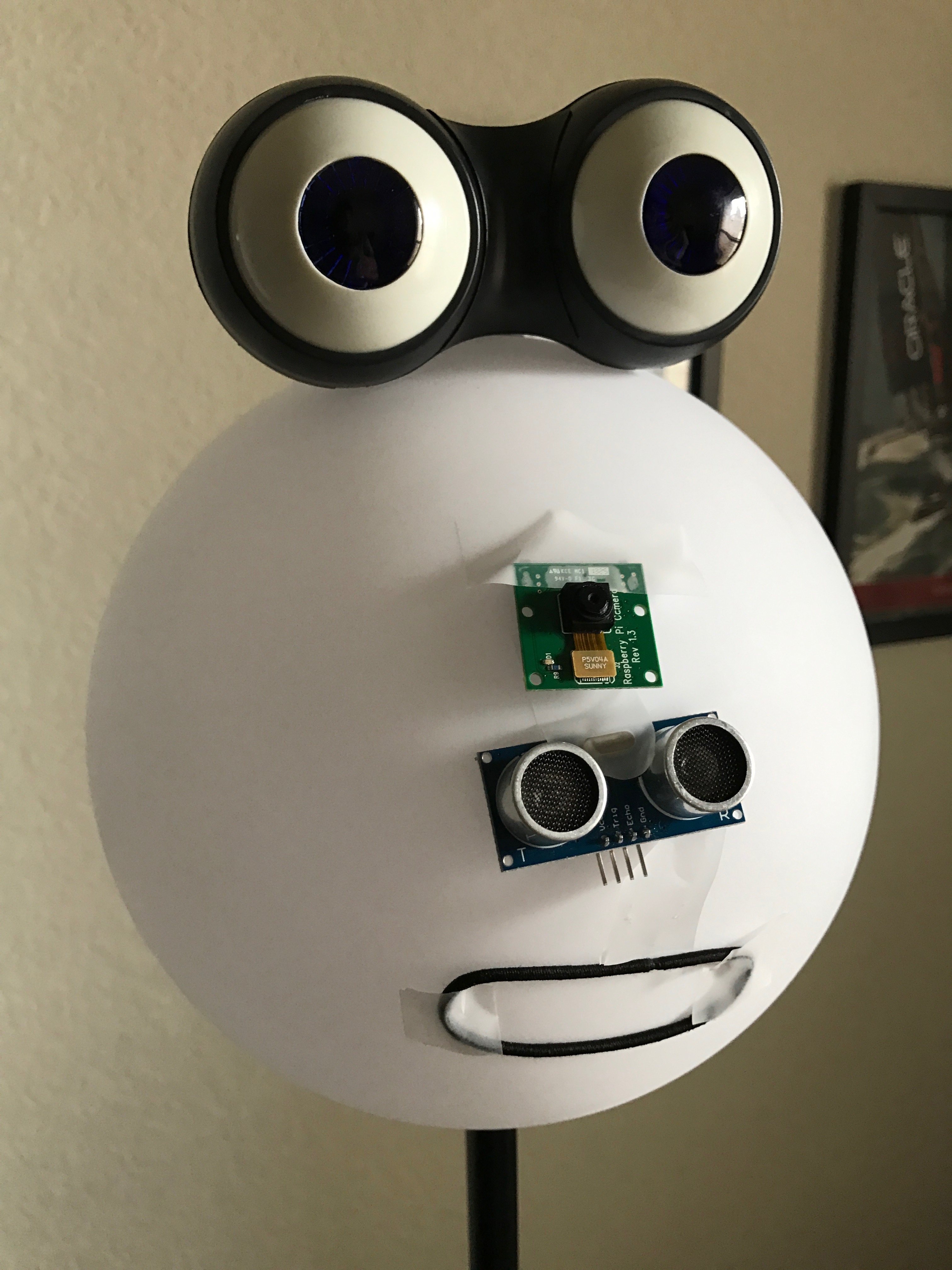
Emotibot, an emotion sensing robot.
A few weeks before the first ever Oracle sponsored Maker Faire, I was experimenting with some of the cognitive (vision) recognition APIs available. Google Vision API, Watson Visual Recognition and Microsoft Computer Vision API are some of the biggest players in this field right now.
After testing all of them I found the idea of Microsoft’s CaptionBot really compelling: Upload an image to the CaptionBot and it will try to come up with a coherent caption based on a mashup of three of their cognitive services (Computer Vision API + Emotion API + Bing Image API). I wrote an iOS app (with it’s own Swift framework) to consume this mashup and took it for a spin.
I gave my phone to my kids to test the app. They ran around the house and were truly amused by pointing the camera to an object and getting a description.
So when the call to create a project for Oracle Maker Faire with my kids came, we sat down and started brainstorming. The concept was still fresh on their minds; A computer could guess as close as possible to what an object is and even guess a facial expression.
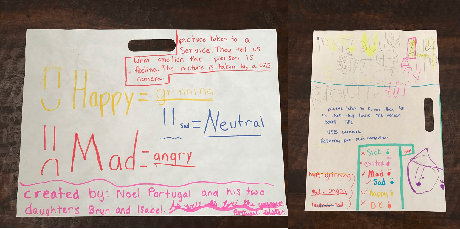
Brainstorming ideas
They came up with a plan and a name: Emotibot, an emotion sensing robot. We drove to the closest Home Depot to find materials. We found an Led Glow Ball Lamp that worked perfectly for the head of our emotion sensing robot.

Staging parts before drilling holes
We used the following materials to build our robot:
- Raspberry Pi 3
- Raspberry Pi Camera
- Ultrasonic Ping sensor
- Adafruit 16-Channel 12-bit PWM/Servo Driver
- 1 Mini Servo
- 2 blink(1)
- Led Glow Ball Lamp
- Peep n’ Peepers Flashing Eye Lights
- Speaker
- Mic stand
- Hair band (for the mouth)
The robot worked as follows:
- The Ultrasonic Ping sensor detected when someone was close to it (about 10 inches).
- The robot started to talk using festival-lite or flite. The mouth servo was synchronized with the flite by counting the words and moving the mouth for each word spoken.
- A picture was snapped and submitted to Microsoft Emotion API. The JSON result was parsed and then spoken with flite by Emotibot.
- Using the blink(1) USB LEDs the robot changed colors based on the emotion.
- At the end we also added a microphone array to interact with the robot, but since we knew it was going to be noisy we didn’t enable that part during the faire.
Overall the project was a success. I was able to involve my kids and they learned some concepts along the way. If anyone is interested to see the code hit me up in the comments and I might put it on Github.Possibly Related Posts:
- Maker Faire 2017
- It’s Almost Maker Week
- AppsLab at the Maker Faire
- Another Take on Maker Faire 2015
- Maker Faire 2016
Pac-Man on a String
Oracle hosted the first-ever company co-sponsored Maker Faire event on November 17, 2016.
When I heard of the event, I had something in my mind that I would encourage a group of middle-schoolers to make a game for the event. I have been teaching them occasionally on Arduino, NodeMCU and MQTT concept over some weekends, and this is the perfect opportunity to put them together in a build.
After some brain-storming, we came up with “Pac-Man on a String” concept. And because of the way of this game plays, the player needs to rush to a location and do a quick action, I picked the team name as “JET – React” to describe the game play, (and if you are writing JavaScript at Oracle, you know JET and React).
There are some interesting design points we have put into the build:
- We want to make a game that is simple, anyone can come by and play;
- We want to make a game that is addicting and challenging (which seems to be conflicting with point #1), so people can keep playing for many times and not getting bored;
- Simple control and interface.
So we adapted the game plot of well-known Pac-Man, and changed narratives to collect gems (as Emily likes sparkling gems), and changed ghost to wasp so we can flee or just attack at the spot with precise timing. Coding-wise, it turns out “wasp” is very much like “gem” except it chases player (represented as 5-LED segment).
The modified game story and play mechanism fit very well with the limited control and interface we have. Making a interesting game with just one joystick and one LED strip, that presents serious constraints as what you can work with. But in the end, I think we achieved excellent results.
To make it simple, we coded 5-LED segment (we call it Saber) that a player can move it up and down along the LED strip, and use that to collect a gem or attach a wasp. Most people can align 5-LED to sparkling dot on the strip, right?
To make it challenging (that is to gain high score), we made the scoring logic to require a player has great timing and quick reflexes. First, all the gems and wasps can show up at any location, any moment, for any length of duration (all the parameters are randomly generated). So player has to move fast, and quickly decide what to do when multiple gems/wasps are showing. Second, the Saber has 5-LED segment, and if you use middle LED to collect a gem, you get 100 points; the two LED next the middle one will get you 50 points, and two side LED get you 25 points. So it has great incentive to use the middle LED to do your work, but it is very difficult to move the Saber to the right spot, it requires great skill of timing and anticipation. And finally, the wasp can sting you, but if you are quick enough, you can knock it out before it can sting you, and you gain points, that requires great timing skill. Overall, it takes practice to play this game well.
So here is the team info and game play description:

These are the components and flow for the game build.
The game code is on the Arduino Mega board, where the player moves Saber to collect and attack. The code controls all LED light state at all time, which represents space, gems, wasps, as well as detect the player action, and Saber to gem/wasp collision time. It has scoring logic when detected collision, and sends game events to NodeMCU for reporting.
The code on NodeMCU is to rely game events into CloudMQTT, so that the App on Tablet can get the events, and starts/stops game, or accumulates points. Once a game is over, the score is recorded into Oracle Apex database for keeping the Leader board.

First prototype build, using a wooden tea box:

This is the cleaned up final build, hosting all components in a acrylic box:

This is the close-up look at the inside of box:

Score board and leader board in an Android App:

The game as played out at the Maker Faire. Both adults and kids had a blast!

Update: Here’s a video of the gameplay.
Possibly Related Posts:
- IoT Workshop Guide – part 1
- Mixed Reality Demo – The Physical Parts
- What If Enterprise Software Were Produced?
- Real Time Ambient Display at OpenWorld: The Software (for the Hardware)
- IoT Workshop Guide – part 2
Trip to Black (W)holes

Last week my kids’ school went on a field trip to the University of Santa Cruz to observe a black hole multimedia exhibition. We were invited there by Enrico Ramirez-Ruiz, the astrophysicist and the fellow parent at the school. When Enrico is not busy pushing the frontiers of science (he is partial to violent explosions), he teaches astrophysics to children age 4 to 12.
The exhibition combined the visualized data from recent Extreme Mass Ratio Inspiral (look it up) event, projected to the round screen on the floor, with the sound mapped to the acceleration of the star matter spiraling into the black hole, and an auxiliary animation of Einstein’s scribbles projected to the walls. It was an immersive experience.
The reality of being INSIDE of the installation, together with friends and the teacher, stimulated thinking and collaboration. Kids started asking questions, and there were no stopping of them. Enrico is awesome at understanding underlying questions children ask no matter how well or poorly they express the questions with their words.
There were certain abstractions in the visualization – it was rendered in a logarithmic scale, the perpendicular rays had to be “flatten” to the projection plane, the meaning of color was reversed to red for hot and blue for cold. Interestingly, these abstractions provoked more thinking and more discussions.
Enrico explained it is a balancing act to find a happy middle between scientific accuracy and intuitiveness of visualization.
Where the visual props come short, Enrico switches to explaining with his hands, he is as good at it as Richard Feynman was, creating a kind of single-actor science visualization theatre.
I was fascinated to hear from Enrico that, as a scientist, not only he uses imagery for explanations, but he also thinks in images.
I’ll use this as a good excuse to break into quoting my favorite parallel quotes.
Enjoy.


 Possibly Related Posts:
- What Would You Study Now?
- Computer Science and Philosophy at Oxford
- Angry Birds All Levels
- Anthony got tagged!
- Interactive Children’s Books for Tablets
A Personal Assistant Technologies or PAT Hackathon
When tech media started proclaiming 2016 as the year of the bots, they seem to have nailed it. At Oracle we have at least three groups working on bots, OAUX included.
One of the latest forays into bots was a Personal Assistant Technologies (PAT) hackathon, organized by Laurie Pattison’s (@lsptahoe) Apps UX Innovation Events team, open to people across Oracle. The goal? Create a great use case for bots with a great user experience.


Because I’ve done a fair amount of research on bots recently, I was selected as a mentor, though the MVM (most valuable mentor) prizes definitely went to Anthony Lai (@anthonyslai) and Noel Portugal (@noelportugal), who provided all the technical assistance for the teams.

The most interesting part of a hackathon is, of course, at the end. Each team has three short minutes to show what they built and why it’s awesome. There were a lot of teams, covering use cases from sales, service, supply chain, finance, developer tools, and project management. It was a pleasure just to see all the creativity across groups that came from distant parts of Oracle—including a few who traveled all the way from India and Armenia just to participate.

The teams had to use an NLP system and a bot framework to interact with Oracle systems to actually do something—some were more transactional, others more about querying information. The most important thing (to me, at least) about a bot use case is that it needs to be better than the existing way you’d do something. Why would a user want to use a bot—something new they have to learn, even if it is easy—instead of doing it the old fashioned way?
A big part of the potential value of bots is that it’s easy to use them from a variety of devices—if all you need to do is type or speak, you can easily use a mobile device to send a text message, Amazon Echo, your IM on your desktop, or maybe even a smartwatch. The teams used a variety of input methods, pointing out the real value someone can unlock with the ability to be productive while on the go or in contexts we don’t normally associate with work.

Also represented in the mentor and judge crowd were Oracle Virtual Assistant (part of the RightNow team), and the Chatbot Cloud Service, which Larry Ellison introduced at OpenWorld this year. Some teams leveraged the Oracle Virtual Assistant for their submissions, but it wasn’t required.
It’s an exciting time, now that natural language technology is finally enabling some wonderful user experiences. I, for one, am looking forward to seeing all the upcoming cycles of design-build-test-repeat in the quest for a useful and productive bot experience.Possibly Related Posts:
- Busy Times Are Afoot
- BIAC Connected Communities, Connected Lives Hackathon
- AppsLab Research in 2015
- An Oracle Partner Cloud Integration Hackathon in Sydney
- An IoT Hackathon in Utrecht
Mixed Reality Demo – The Physical Parts
I have been always intrigued by the fact that people get deeply attached to the characters in the game (e.g. Second Life), or virtual pets. And with sufficient advancement in technology, the virtual characters may eventually cross the boundary and get attached to real-life people (e.g. Sci-Fi movie such as “Her”). While that is still a little far away from now, I’ve been looking to explore the 2-way communication and interaction between virtual and real world.
At AppsLab, we have enough skills to build some physical toys that we can communicate and control, but we miss a game or virtual environment that is appealing and communicative. I tried interact with Minecraft environment but stopped when it was sold. So Jake’s casual mention of MindWurld from Ed Jones (@edhjones) sparked a great interest!
MindWurld is a fantastic game. You can choose a virtual character (Avatar) to walk around Hawaii island to free and rescue pigs, also collect treasure, and play trick of spawning pigs and catching them with Pokeball. And yes, we have full access to the source code. (see Ed’s post for details)
So we came up with a game plot quickly, as manifested in the final build:

Real controller – Virtual avatar – Real robot
- Player in Real world communicates to a virtual character in MindWurld;
- Virtual game character and object has a mirrored object in the real world;
- Events or actions happening in sync between real and virtual objects.
This is how we put things together:
Step 1 – Toy guitar as controller
We thought of using player’s own cellphone to call a number to reach the Avatar (the virtual character in game), and just talk over the phone to tell Avatar what to do. But voice service provider was not responsive enough and we were approaching OpenWorld soon, so we ditched that approach and went for a customized controller.
Ed is a guitar player, and the virtual Avatar would be attending OpenWorld on behalf of Ed, so it is fitting that we use a toy guitar to represent him.

A toy guitar mod as controller
The toy guitar essentially provides many buttons that I can use to convey various commands and intentions, but the mod itself is a little bit more complex, as each button produce a set of signals feeding into a chip for playing music, it is not a clear simple one push to one line reading.
I used one Arduino mini pro to read signal patterns for each button push and did some noise filtering and process, and then translated them into “a player command,” which is feed into a Bluefruit EZ-key HID chip. The HID chip can connect to a computer as HID device, so each “play command” is a simple key stoke input to control the game.
Step 2 – MiP robot as mirrored avatar
MiP robot from WowWee is an inexpensive but very capable little robot. It can balance itself on two wheels, and can move back-forth, and spin on the spot, and that makes it having accurate travel along any path.
Oh, and it is quite a character. It makes happy, grumpy and lots of other noises, and shows many light patterns, to express full range of emotions!

MiP robot as buddy in real world
The best part for our developers – it has an API in many languages that we can program and control the movement, sound and lights.
So for whatever events happening in the MindWurld game, such as the avatar walking around, opening treasure boxes, spawning pigs, freeing pigs and rescuing them, they are sent over a socket to a my Robot controller program, which in turn asks the Robot to perform corresponding movement and act in certain cheerful ways.
Originally, I made the MiP robot to be the mirror of virtual character in the game, in a sense that it walks the same way as his virtual part in game. It requires a large area for it to roam around. For the OAUX Exchange at OpenWorld, due to space limitation, I reprogrammed it to be a buddy of the virtual character, so it does not move too much, but makes noise and blinks light to cheer for his virtual friend.
By now, we can test out the full cast of game!
Step 3 – Juiced it up with a Pokeball
Meanwhile, Mark (@mvilrokx) had been busy printing Pokeballs: 3D printed shells, polished and painted, outfitted with unbalance motor for vibration, LED for light color effect, and NodeMCU for network connectivity, and hooked up to a MQTT broker ready for action.

Pokeball used to catch pig in virtual world.
Ed quickly outfitted the virtual character with a ball in hand, throwing at pigs to rescue them.
I just quickly added a MQTT client code, replied ball-thrown and pig-rescued events to MQTT broker. And the Pokeball in real world would vibrate and flash when the virtual character throws and catches pigs in the MindWurld.

Play it out at OAUX Exchange
Oh, that’s the Mixed Reality game setup at OAUX Exchange. Anthony had 3 days of fun time playing Rock Star, together with “real” people, “virtual” avatar, “real” avatar, “virtual” balls and “real” balls.Possibly Related Posts:
- Pac-Man on a String
- How I Attended Oracle OpenWorld 2016
- A Smart Badge for a Smart Office
- Where to Find Some Robot Action
- OpenWorld 2015 Highlights